The state of mind & soul every customer reaches before clicking on “Buy” button is called The Grand Pain for Paying. According to the level of this pain, there are two main types of customers:
Tightwads – they intend to spend less than they would ideally like to spend
Spendthrifts – they experience too little pain of paying and usually spend more than they would ideally like to spend.
In both cases, customers feel the pain both before and after making a purchase. But, what’s the most important: they spend either ways! The consequences of spending too much or, ideally, less, are happening afterwards. Having that in mind, purchase decisions can increase if prices are made in correct format. On the other hand, these visual tricks will decrease the pain for paying and will only foster purchase decisions.
Price is one of the main visual and cognitive motifs prior to making a purchase. Ecommerce experts are there to release the pain by designing price formats that look different, but, actually, sell for the same amount. There are 4 most common (mostly visual) price formats seen at most online stores that you should take into consideration:
1. Format a good round or decimal amount
What’s the difference between a round and decimal price? From a consumer’s point of view, the first impression when they see the price format is regarded as purely psychological. At the same time, this first impression usually determines the final purchase decision. For a shop owner, the price format is cleverly calculated in order to bring more revenue. If the price format (either a round or a decimal amount) is eye-catchy for a consumer, then both sides (consumer & the shop owner) will find it satisfactory.
Decimal prices create the feeling that the price is lower. In fact it is, but the difference between the nearest round price and the one “broken by decimals” is not even worth mentioning. However, decimal prices usually include number 9 at the end (for example: 5,99), which is considered to be a magical number in the e-commerce world.
On the other hand, round prices are sign of accuracy and are easily calculated. For example, if a consumers tend to purchase more items at once, the final price will be easily calculated in their minds if separate prices are displayed in round and not decimal formats.
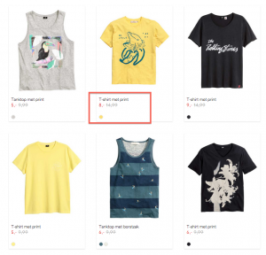
Regarding this comparison, we found an interesting example where prices are displayed in both round and decimal formats. In both cases, there is no currency anywhere. This is maybe because the shop sells its products to Dutch market, where Euro is a default currency. However, if you sell in more than one currency, it’s recommended to show them besides each price value.

Screenshot taken from: www.hema.nl
2. Change price colour
Colours are connected to visual memory, which is about 80% of entire remembering process. On the other hand, colours are real decision-makers when it comes to purchase. Consumers are more likely to choose a product by its colour rather than material. So, this is often the first and most important impression in the buying process. E-commerce specialists know this very well when they determine the colour of displayed price.
Different colours emphasize which type of goods you will choose. For example, black colour represents a powerful brand and is often connected to luxury brands. On the other hand, we often see red colour for products on sale. Red is for energy and it increases the urgency of buying before the product is out of stock. Most prices on sale are coloured in red. The alert for “Buy me now, I am cheap” creates anxiety that somebody else might get the item because it’s on sale.
Regular prices are usually coloured black, representing the steady value of the item. Depending on the industry, many shop owners choose to colour the prices according to their shop’s design. However, most examples show regular price colours in black and sales price colours in red.

Screenshot taken from: www.hm.com/nl


